Hottest Interior Paint Colors of 2020
Five trending colors and ideas for using them in your home
When you shop through retailer links on our site, we may earn affiliate commissions. 100% of the fees we collect are used to support our nonprofit mission. Learn more.
After being cooped up and looking at the same four walls for several weeks, you might have the urge to give a room or two a fresh, new look. Before you pick up a brush or roller, however, you have to choose a paint color. How to decide?
At major paint manufacturers, color experts create palettes to help you choose. They spot trends and look to a number of industries, including fashion and automotive, for inspiration when selecting colors that they predict will be popular with consumers.
While the hot paint colors for 2020 were determined before the coronavirus pandemic, color experts we interviewed from Benjamin Moore, Behr, PPG, Sherwin-Williams, and Valspar say they still foresee the warm, tranquil shades being popular colors. (If you buy paint at a walk-in store, consider wearing a mask, and employ basic infection control practices.)
“When we look back through the decades and track which colors were most popular during a given time, we find that in times of uncertainty, people gravitate toward colors that are warmer and more grounded as they are relatable and bring comfort to the home,” says Andrea Magno, color marketing and development director at Benjamin Moore.
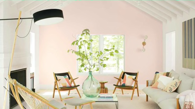
Benjamin Moore: First Light 2102-70
Ben Moore Ben Moore
Benjamin Moore's First Light is a “soft and sophisticated blush hue that brings a rosy warmth to any room,” Magno says. “It can envelop a room in a soft way that doesn’t overpower.”
Sounds perfect for cozy days at home. Use this color to add a glow to your living or dining rooms. Magno suggests using a matte finish or a very slight sheen, such as eggshell, for the walls. For trim, consider a satin finish instead of the usual semigloss, as it has a touch less shine to it, furthering the soft look.
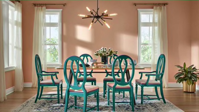
HGTV Home by Sherwin-Williams: Romance HGSW2067
hgtv hgtv
You might not think of this blush pink, which has a hint of apricot, as a neutral color, but Ashley Banbury, senior color designer for HGTV Home by Sherwin-Williams tells us that the definition of neutral is changing from the shades we’re used to. “Our view on neutrals has expanded outside the typical gray and beige, and we have begun to embrace colorful shades that are soft and welcoming,” she says.
In a dining room, this color adds an element of calm sophistication. But it also works nicely in a bathroom, Banbury says. You can pair Romance with a deep teal jewel tone, like the company’s Island Time, for a stylish combo, or the peachy Coral Reef for an interesting monochrome look.
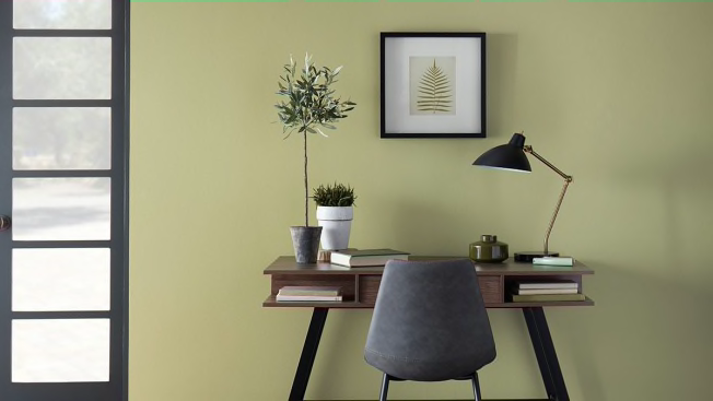
Behr: Back to Nature S340-4
behr behr
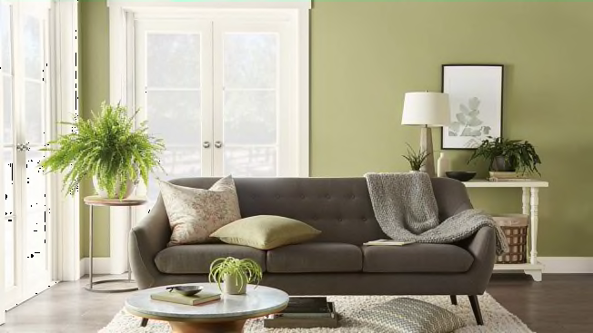
Behr’s Back to Nature is a soothing green that connects us to nature, says Erika Woelfel, vice president of color and creative services. Like the HGTV Home by Sherwin-Williams Romance, above, Back to Nature is a “new neutral” color that brings tranquility to a room.
When you’re considering the trim for this paint, Woelfel recommends choosing a color that is complementary but also provides a bit of contrast. “A bright and vivid trim color will add energy to your home, while highlighting the earthy tone of Back to Nature,” she says. Of course, whites work well, too; Woelfel suggests trying Behr’s Ultra Pure White and Bit of Sugar.
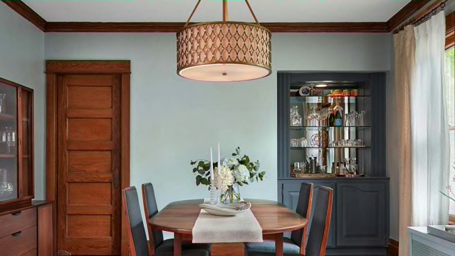
Valspar: Grey Brook 5001-1B
valspar valspar
“Grey Brook is a welcoming pale blue, reminiscent of stonewashed denim,” says Sue Kim, color marketing manager at Valspar.
It’s versatile and works great in spaces with an open floor plan, Kim says. You can pair it with varying shades of grey and blue, and paint the trim in Valspar’s Swiss Coffee, a warm white, to complete the look.
PPG: Chinese Porcelain PPG1160-6
Sylvie Li Sylvie Li
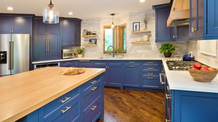
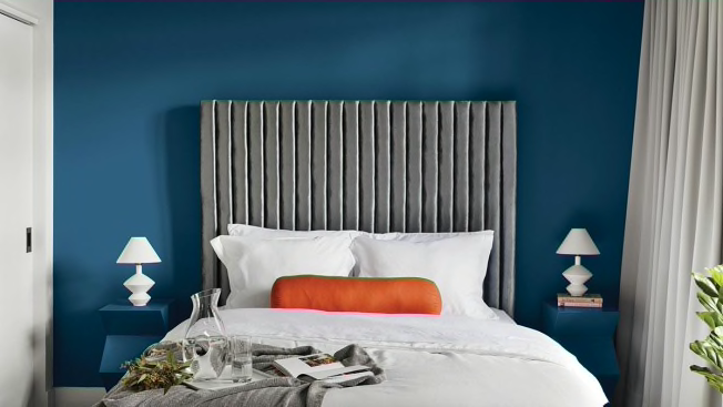
This hue, Chinese Porcelain, is a mix of cobalt and navy, says Dee Schlotter, senior color marketing manager for PPG. Navy blue creates a sense of calmness and hope—think of the horizon as you look out to sea and there’s a blue sky. The cobalt, a vibrant blue, injects energy.
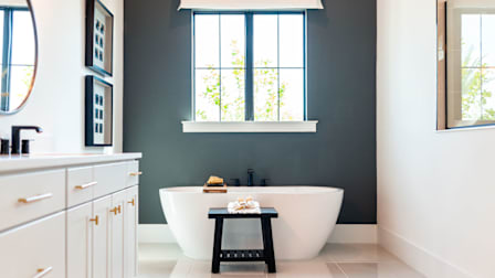
Blues are a nice transition away from the gray hues that have been popular over the past decade or so. Chinese Porcelain works best in a bedroom, either as an accent wall or on all of the walls if you get a lot of natural light, Schlotter says. It also looks great in a sunny family room or a bathroom. Use a crisp white for the trim.

